 |
|
|
#1 (permalink) |
|
Fledgling Dead Head
Location: Clarkson U.
|
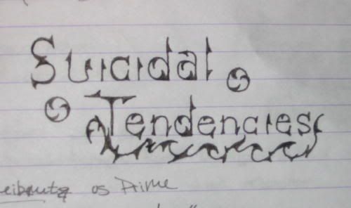
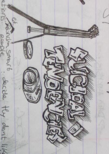
Suicidal Tendencies doodles.
Just a couple of doodles from my new notebooks, based around the band suicidal tendencies... I like to do letters.
  As usual, creiticism is encouraged, I like to see where other people think I can do better. |
|
|
|
|
#3 (permalink) |
|
Femme Fatale
Location: Elysium
|
It's the first time I've met anyone else here apart from me who likes to do letters
 Personally I like the first one better. There are so many versions of the ballon-like font in nr#2 and I find them all boring and just plain ugly. Considering the gloomy name of the band a ballon-like font really doesn't suit it. I'd stick with #1 with the sharp and pointy serifs.
__________________
I have all the characteristics of a human being: blood, flesh, skin, hair; but not a single, clear, identifiable emotion, except for greed and disgust. Something horrible is happening inside of me and I don't know why. My nightly bloodlust has overflown into my days. I feel lethal, on the verge of frenzy. I think my mask of sanity is about to slip. |
|
|
|
|
#4 (permalink) |
|
Fledgling Dead Head
Location: Clarkson U.
|
Haha, Funny, I thought the second one came out better. I do like the first very much, but I messed up the sizing of the letters in the word "Tendencies".
I think the style fits the band, but not quite what I have drawn in number 1. Its lacking something. |
|
|
|
|
#5 (permalink) |
|
Psycho
|
i think the second one is mimicing grafitti typography, which better suits the band then the first one. if you are interested in letter forms and typography you should check out some magazines...like juxtapoz or while you were sleeping, etc.
__________________
end |
|
|
| Tags |
| doodles, suicidal, tendencies |
|
|